
People come to a charity website with a job to do. They might need help today. They might want to donate, or give their time. Or they might just be checking you’re who you say you are.
If your site gets in the way of any of that, it costs you trust. And trust is the one thing a charity can’t easily buy back.
We’re Inkfire, a disabled-led digital agency based in Bournemouth, and we work with charities, community projects and public sector teams across the UK. This guide covers what a charity website needs to do, the basics of trust and accessibility, and what we learned rebuilding Reasons to Stay.
What does a charity website need to do?
A charity website rarely has just one job. It often has to connect people to services, take donations, recruit volunteers, share news and keep supporters inspired, all at once. Those goals pull in different directions, and it’s easy to end up serving the loudest one while the rest get forgotten.
So start by picking the two or three actions that matter most, and make them impossible to miss. For most charities, that looks like this:
- someone who needs help can find your service information in a couple of clicks, ideally from the home page
- a donor can see where their money goes before being asked for card details
- a volunteer understands what the role involves and what happens after they get in touch
- a funder, journalist or partner can find a named contact without hunting around
Everything else supports those routes. News and campaign pages are worth having, but they shouldn’t sit between a visitor and the thing they came for. If your donate button is hidden under a slideshow, or your service details are stuck in a PDF, your design is working against you.
The basics of trust
Trust comes from small details people can check, not big claims. A few that make a real difference:
- Your registered charity number in the footer, where people expect to find it.
- A real contact: a named person and an email address someone actually answers.
- Real photos of your people and your work, used with consent, instead of stock models smiling at laptops.
- Plain language. Say what you do, who it’s for and what you can’t help with. If there’s a waiting list, say so. If you only cover part of the country, say which part.
A vague website feels evasive. Being clear, even about your limits, is what makes people trust you.
Build accessibility in from day one
Accessibility isn’t a tidy-up job for the end of a project. Adding it later means rewriting templates, retesting whole journeys and rebuilding things that were signed off months ago. Build it in from the start and it costs less, and you get a better site for everyone.
In practice, that means setting a clear target like WCAG 2.2 AA, making sure your key journeys work with a keyboard and a screen reader, choosing readable fonts, and giving people some control over how they read. Test with real people and real assistive technology, not just a plugin score. Disabled people are part of every audience you have, from service users to donors to volunteers.
If you’d like help with that side of things, our web and accessibility team can work alongside your project or run a website accessibility audit on what you’ve already got.
What we learned rebuilding Reasons to Stay
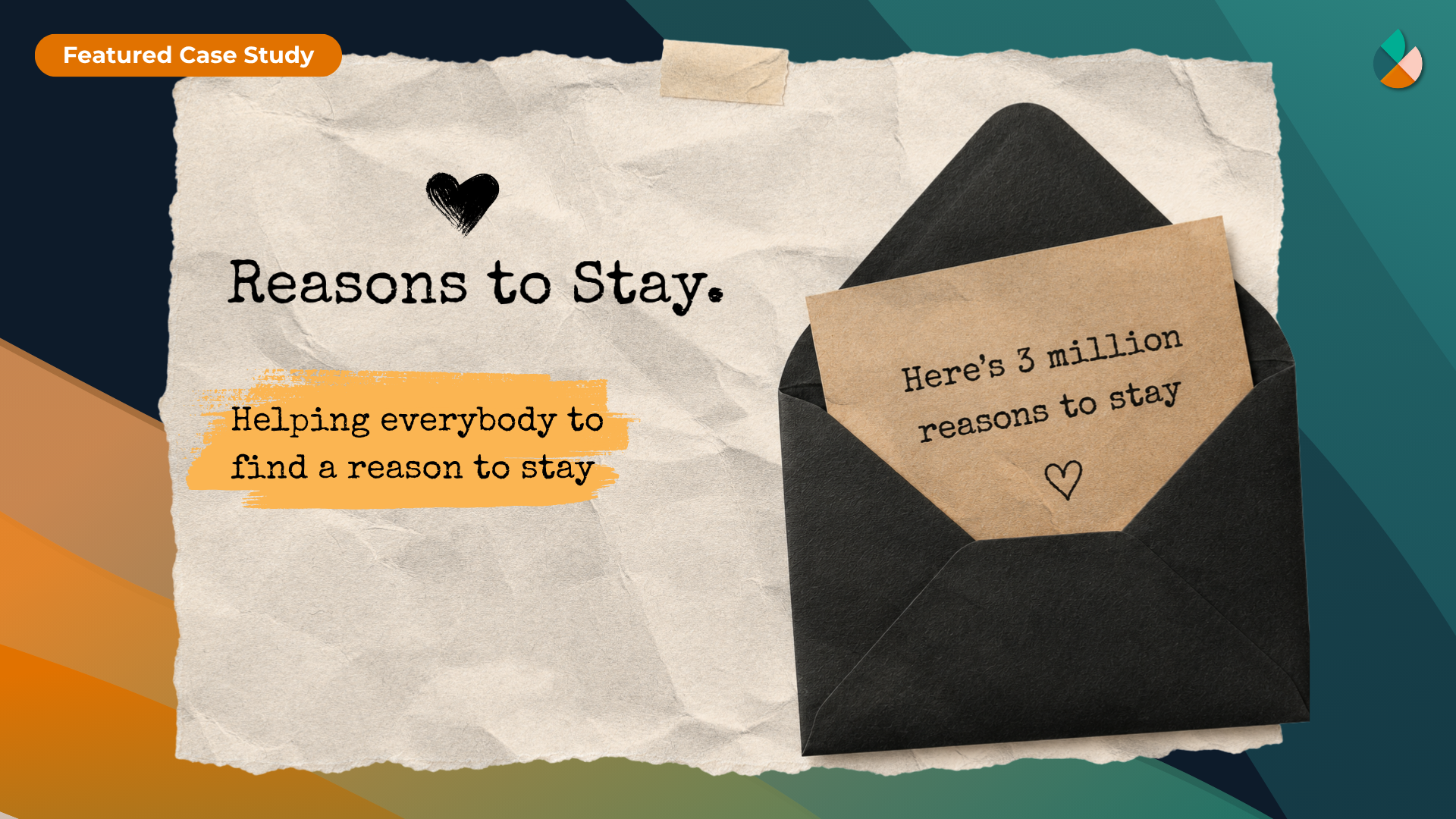
Reasons to Stay is a suicide prevention and wellbeing project where people share the moments, people and reasons that helped them keep going. According to the project’s figures, over 111,000 letters have been submitted and more than 5.2 million have been delivered. You can read the full Reasons to Stay case study or visit reasonstostay.org.
It was never just a redesign
The old site couldn’t carry the scale, responsibility and accessibility needs of thousands of personal submissions. So we treated it as a custom WordPress platform build. The hard part wasn’t how the pages looked. It was handling deeply personal writing from the public without breaking the trust people had placed in the project.
Moderation had to be designed in
Any site that publishes personal writing about suicidal thoughts needs a human in the loop. We built a six-stage moderation workflow: Unprocessed, Processing, Pending Review, Quarantined, Published and Archived. Nothing submitted by the community goes live without review.
Human moderators stay at the centre of it. Automated triage, priority queues, bulk actions and dashboards help a small team manage a big volume without cutting corners. If your charity collects stories, comments or case studies from the public, plan for this before you launch, not after the first difficult submission arrives.
One home for approved content
Approved letters live in one published pool. That pool feeds random discovery on the site, embedded widgets and newsletters, so the same approved content can be reused everywhere without being copied and managed separately.
A Letter Widget also lets partner organisations show a moderated letter on their own websites. The project reaches more people, without losing control of what gets published.
Accessibility shaped everything
The target was WCAG 2.2 AA from the start. The core journeys work with a keyboard and a screen reader, interface text uses Atkinson Hyperlegible Next, and visitors can adjust reading preferences to suit them. None of it was bolted on at the end.
Keeping the warmth
The visual identity keeps the feel of a handwritten letter, with paper cream, ink navy and hope orange. A subject this serious needs warmth, not clinical distance. The design had to hold difficult content gently, and stay calm enough that people could read and write letters without feeling processed.
How to plan a charity website project
A lot of website problems start in the planning, not the build. A bit of structure at the start saves a lot of rework later.
| Goal | What your site needs |
|---|---|
| Help people reach services | Short, obvious routes from the home page, plain descriptions and clear eligibility information |
| Raise money | A visible donation route, honest detail about where funds go, and as few steps as possible |
| Recruit volunteers | Real role descriptions, time commitments and a clear next step |
| Share community content | A moderation workflow, safeguarding thinking and an editor your team can actually use |
| Keep the site running | Ongoing support, a CMS your team can use without a developer, and a plan for updates |
Start with goals, not pages
Before anyone sketches a layout, agree what the site is for. Write down what you want it to achieve in the next year, then check the structure serves those goals. If nobody can say which page matters most, that’s the first thing to sort out.
Know who you’re building for
List the groups who use your site and what each of them needs. Someone looking for support needs something very different from a regular donor, a funder reading your annual report, or a partner sharing your content.
Content before design
Design is much easier once you have real content. Gather your service descriptions, contact details, policies and photos early, and write in plain language. Make sure anything sensitive, like case studies or testimonials, has proper consent. Content that turns up late usually turns up rushed.
Budget for the whole thing
Make sure your budget covers planning, design, build, content, accessibility testing and launch, and then ongoing support. When you compare quotes, compare what’s included, not just the headline price. A build with moderation tools, accessibility testing and training isn’t the same as one without.
Plan for life after launch
A website isn’t finished on launch day. Updates, security patches and new content all need someone responsible. Choose a CMS your team can use day to day without calling a developer for every text change, and agree who you contact when something breaks.
Frequently asked questions
How much does a charity website cost?
It depends on what you need. A small site with a donate link is a very different project from a platform with user submissions, moderation tools and custom accessibility features. Ask suppliers what’s included, whether accessibility testing is part of the price, and what ongoing support costs.
Should a charity use WordPress?
Often, yes. WordPress is flexible, widely supported and easy for content teams to learn. We built Reasons to Stay as a custom WordPress platform because the moderation tools and workflows needed to be tailored. Whatever you choose, it needs proper setup and regular maintenance. Pick it because it suits your team, not just because it’s familiar.
How do we handle user-submitted content safely?
Plan for human review before anything is published. Set up a workflow with clear stages, so a small team can see what’s new, what’s waiting and what’s live. Think about safeguarding and consent, and what you’ll do if someone submits something that suggests they’re at risk.
When should we think about accessibility?
Right at the start, alongside your goals and content. Set a target like WCAG 2.2 AA, make sure your key journeys work with a keyboard and screen reader, and test with real assistive technology during the build, not just at the end.
What should we look for in a web design partner?
Look for someone who asks about your goals before showing you designs, explains accessibility in plain terms, and is clear about support after launch. Ask who’ll actually do the work. Lived experience helps too. We’re disabled-led, and that shapes how we approach every project.